In 1940, the city of Kansas City, Missouri took a picture of every property within city limits for tax assessment purposes. I'm not exactly sure what the intended benefit of such an undertaking was, but one wonderful perk is that we can see a picture of our house 70 years ago! It's amazing to think of how different everything would have been then - with World War II going strong in Europe and Japan, FDR giving fireside chats, African Americans fighting for the right to vote, an average salary of $1,299 in the USA - here stood our house!
Our house in 1940.
When we received the photo earlier this summer we noticed several differences immediately. First, all the way on the right side of the photo you can see part of what looks like some sort of shed or outbuilding in the backyard, which is now long gone. This may, however, explain why when we dug for the fence along the side of the yard we hit several large mortared stones - perhaps an old foundation?
Another change is the landscaping along the front of the porch - I can't imagine what those small trees would look like now, had they been left to grow! When we moved in all plants had been removed from the front flowerbeds, so we had a wonderful blank slate to do planting of our own. I wonder what varieties of plants have graced that area between when this photo was taken and when we moved in last year.
Finally, notice the lovely, lovely shutters! I've been dreaming of shutters on our front windows since we moved in - the old hardware from which these ones hung is actually still in our trim - and this photo was the final ammunition I needed to convince Chris that we should bring back the shutters. I love the classic board and batten style - especially on the cute arched window on top!
It's fun to try to imagine what this house might have looked like then, when it was only 15 years old - a baby compared to now! I like to try to picture the family living in it, how the inside would have been decorated and what major differences the house would have had so long ago. Obviously there's no way to know the answers to all these questions, but this is a fun little glimpse into history!
Our house in the spring of 2010 - notice our tiny little boxwoods! They're getting bigger every day.
Kansas City couple tackles home renovation and remodeling in historic homes of Kansas City Brookside and Waldo neighborhoods.
Monday, August 30, 2010
Sunday, August 29, 2010
An August Weekend
8' Mammoth sunflower from the garden
I don't know if its the high heat of the end of summer, or me just trying to relax a little more on the weekends. but recently, we have been trying to take things a little slower around the house.
In fact, I have not even made a post on the blog for more than a month. In the meantime, Becca has been blogging more often than ever, filling the blog with pretty pictures of things to come.
Hazel greeting me on the couch, for the first time since she was a kitten.
In other news, Hazel has started jumping on my chest/belly, a skill she used to practice exclusively on Becca. For some reason, she has become more spunky and social in the last few weeks, which is cool.
I, the pragmatist, think we need to focus on before and after projects for the blog. However, we have really gotten a lot of comments on her most recent stories, which focus on design and future kitchen plans. What do I know?
Now for some pictures of small progress, from the weekend.
A freshly patched concrete step. The dark grey area is the new concrete, which will probably turn white in a few weeks.
I had been meaning for a while to patch a few small holes in my steps to the house. We have nicely aged concrete steps, so I was apprehensive about matching the concrete color, and making a mess that I can't clean up. Anyways, I just decided to go for it, and cross my fingers.
Wooden form screwed to step.
I screwed a wooden form around the step to guide the new concrete. Once I got it snug to the original form, I mixed up some fast setting concrete in a bucket. The hardest part was not to make a mess and spread new concrete unecessarily over the rest of the old step.
I really tried to mix the concrete with as little water as possible, so it would not be runny/messy.
Old rusted hole in step
There were old holes from a rusted out old handrail, dirt and junk needed to be hosed out before I started mixing the concrete. I also applied a liquid latex paint to help the old concrete and new concrete bond better.
Patching concrete is not very glamorous, but hopefully this latest fix will protect the steps for many more years to come.
Monday, August 23, 2010
First Meal in the New Kitchen
I love this article in This Old House about families celebrating their first day in their remodeled kitchens with a special meal. What should our first meal be once our kitchen is finished? I can promise you it will be accompanied by a chilled bottle of Santa Margherita Pinot Grigio, and followed by crème brulée. Any good suggestions/recipes out there?
http://www.thisoldhouse.com/toh/photos/0,,20413580,00.html
We've always said we'd host a "better late than never" housewarming once the kitchen is finished, as we believe our downstairs will finally be fit for hosting. When we moved in we were so overwhelmed with tons of repairs necessary for daily life, we never really celebrated the new house. As time dragged on we decided that this project would finally make the house worth celebrating. So, watch for that invite!
Saturday, August 21, 2010
Happy Hibiscus
As I wrote earlier this summer, I planted some perennials in our new backyard garden beds with the hope that they'd root this year and give us big blooms next summer. Much to my delight the hardy hibiscus plants I put in are blooming already. The enormous red blooms look ridiculous on the tiny twig of a plant, which leans dramatically with the weight of each bloom, but they're already quickly growing and are a joy to watch fill in and bud more and more each week. Based on what they've done so far, I can't wait to see what they produce next summer.
La Toilette
Chris and I spent a wonderful morning poking around Brookside this morning. We don't enjoy the shops and cafes nearly enough - perhaps because a majority of our weekend mornings are spent working madly on projects around the house. It was a treat to take the day slowly and browse the farmer's market, sit outside with an iced coffee and walk through the eclectic boutiques. We ended our outing at one of my favorite places in the world - J'Adore - a French-inspired boutique with treasures for the home and garden. I always have to practice restraint in that store, but today I treated myself to something to hold onto for our half bath.
This little iron plaque is a perfect indulgence for the Francophile in me, and will be a fun detail on the door to our half bath. As I was adding it to our stash, I saw a box I hadn't opened since last Christmas, when my parents gave it to Chris and me.
So I got it out of the basement, dusted it off unpacked this:
We requested this sweet Tiffany-style pendant for over our kitchen sink, as well as this matching semi-flush light which we put in our upstairs hallway.
It replaced one of these dingy single-light fixtures. We love the warm new color, the brighter glow and the dramatic shadows it makes on the ceiling.
The old one pictured here is at the bottom of our stairs, between the living room and kitchen. We plan to upgrade it soon too, and it will most definitely not be missed.
Well, now it's time to pack our little pendant back up, as well as my new "toilette" sign and the rest of the goodies we're collecting. It's wonderful to take them out every now and then and look at the pieces, imagining how it all will come together.
We're still in waiting mode, but in the meantime another link came off our chain just yesterday . . . . . .
Thursday, August 19, 2010
Playing the Space Game
We're still waiting to find out exactly how many square feet we'll have to work with in our half bathroom. We know the room will be small, but our fixtures will depend very much on the space available.
For example, if the room truly is tiny, we plan to use a small wall-mount sink. The benefit is that since no part of the sink rests on the floor, the small room feels more open and less cramped. The downside is that it's a small sink - higher risk of water splashing/overflowing out of the sink - and it offers no storage. Here's one we like:
This sink is ideal for a small space, sticking out only 10" from the wall.
With a little more space, we can upgrade to a standard pedestal sink. It would look great - very true to the classic look we love, and with a slightly larger basin there would be less risk of the splashing that we worry about with the wall-mount. The only downside - still no place to stash stuff.
This little pedestal would look great - simple and classic.
Finally, if the floorplan surprises us and is larger that we're expecting we'll spring for an actual vanity. I have a feeling I'm asking too much, but a girl can hope. Anyway, if space allows this is what we'll go for.
Isn't it pretty?
Whatever we end up with we will, of course, be thrilled. (Especially if it's the last one).
Wednesday, August 18, 2010
Architects Beware!
If you are an architect, or have any experience in the architectural arts, I strongly encourage you not to read this post. Since we started kitchen dreaming, I developed a liking for drawing out floorplans. The fact that I like it in no way means that I have any skill in this area. You have been warned.
So, here's how our kitchen is currently laid out.
So, here's a little virtual tour. Let's say we're walking in from the backyard (bottom right corner). The makeshift hutch will be to your right in the mudroom area, then you walk through a second doorway (part of the "useless wall") and enter the main kitchen area. The cabinets/counter make an L shape to your right and ending with the stove in front of you. To your left is the makeshift fridge/island setup. If you walk through the doorway on the left you end up in the dining room, then can take another left into our little office (currently about 8'x11'), with a large hall closet that backs up into the current kitchen (behind the "useless wall").
Now, here are plans for the future kitchen:
You may notice the following big changes:
1. Useless wall gone.
2. Island in the middle of the kitchen.
3. Is that a toilet where the closet used to be?
So, let's do our virtual tour. We'll walk in through the back door and our L-shape cabinet/counters will immediately begin to our right - no second doorway, no hutch. After 4 feet of floor-to-ceiling pantry cabinets the counter begins and makes the stretch all the way around to the new stove. To your left is a floor-to ceiling wooden cabinet panel, behind which sits the fridge. Since we've removed the old closet we've added about 15 square feet to the main kitchen area, opening space up for the center island. Now, we can take that same doorway on the left wall into the dining room, and when we walk into the den you might notice it's now 8'x8'.
The first doorway on your left in the den will open to reveal a (slightly smaller) hall closet to replace the one that the kitchen absorbed. The second doorway (this one is exciting) is a half bathroom! Surprise! When we say kitchen remodel, what we really mean is kitchen remodel/bathroom addition. It will be a very small room - under 15 square feet - but just large enough for a little pedestal sink and toilet, putting the first ever first floor bath in our old house.
Here are a few more items we hope to put in our new kitchen/half bath:
Our island will have an overhang on the left side (toward the dining room) just large enough for a few of these saddle stools.
A couple of these cheery rugs will soften our steps by the back door and the sink.
Dramatic 8" pulls will add drama to our simple, shaker cabinets.
I love hanging pot racks, but my old wall-mounted one won't fit with our old layout. A ceiling-mounted pot rack will give us a place to display pots over the new island.
Tuesday, August 17, 2010
The Waiting Game
Every Friday morning Chris and I wake up very excited. I attribute this to a few things:
1. It's Friday. Who isn't excited?
2. We tend to celebrate reason 1 by getting a drive-through breakfast sandwich. It's a wonderful, delicious guilty pleasure.
3. Time to tear a link off this chain.
It may seem like a strange Friday habit, but it holds tremendous significance to us. Each link on the chain is a week of savings we need to do before we remodel the kitchen. So, each link removed is one less week to wait.
While we're not exactly nearing the end of the chain yet . . . .
it's a great reminder to us that we're closer than we used to be.
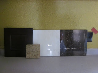
When waiting gets really hard, I go down to our basement and grab these items to line up:
We recently began stashing samples of the materials that will make up our future kitchen, so that we can remind ourselves why it's worth making do for a while longer, to do the kitchen how we really want.
Espresso stained Shaker-style oak cabinet door, Kashmir Gold granite for the countertops and Hampton Carrara marble subway tiles along the backsplash.
Hampton Carrara and St. Laurent marble for a checkered floor. Notice the paint swatch, in jalapeno, for bright, cheerful walls.
Chris and I are both big planners, so even though the kitchen remodel won't begin until next summer, we pretty much have the details ironed out. Here are a few other items that have inspired our plans.
Floor inspiration - we love the look of checkered tiles set diagonally.
A farmhouse sink with a bridge faucet will help us pull off the "craftsman" look we're trying to accomplish.
We love this granite because of the grain that looks like sand, and stretches all the way from one end of the counter to the other.
A new range with all 4 burners working! (Our current stove only has 2 functional burners). We want a gas range to help it fit in in an old-looking kitchen. The stainless steel may not be so craftsman, but I guess you can't win them all!
Elephant in the Kitchen
This will be my first in a series of kitchen posts. Get ready for some serious ugliness!
Since the house was bank-owned when we bought it, we can only piece together what happened to it before we owned it based on clues and and stories we can fabricate. That said, we know that the owner prior to us only lived in the house 11 months before they were foreclosed. We have a suspicion that the owner prior to that (so up to January 2008) did a quick "flip" before they sold it. (I put flip in quotes because normally flip would imply they made improvements. In this case that's very hard to believe).
We're pretty sure that this "flip" involved the kitchen, the bathroom, finishing the basement and painting some of the rooms. I would show you a picture of the kitchen from our inspection day, post-"flip" but we seem to have lost those pictures. Consider yourselves lucky.
If I could find photos, I'm sure you'd cringe at the bright yellow walls, the peeling blue linoleum, the tacky thermafoil cabinets, the cheesy, broken blue laminate counter, etc. What you wouldn't see in the picture (but unfortunately it was still there) is the sink that was used as an ashtray, the apartment size fridge from which all the shelves were missing, the broken pipes in the ceiling and the dead mouse that was in the sink on move-in day. No joke.
Anyway, we've made some adjustments to make the kitchen sanitary and livable while we save our pennies for a total gutting. Mouse is gone, sink is thoroughly bleached, fridge is replaced, pipes are repaired (thanks again, Dad), the walls are repainted and we stripped the floor down to the roughed-up old hardwoods. Here's our current interim state.
View from the dining room. The pear green walls are a big improvement over the former Crayola yellow. We still get by with the cheesy cabinets and poorly installed counter.
We replaced the fridge this winter, due to the fact that every time we opened the door to the old one everything fell out. The island to the left of it is a temporary solution to provide additional counter space and storage for the time being.
View from the back door. The wooden cutting board to the right of the stove hides a spot where somebody set a hot pan directly on the counter. Notice the classy trash can, thanks to Realtor Mike!
Looking toward the back door. The hutch is a temporary solution to create storage in an otherwise useless corner.
So, that's our kitchen for now. We get by with it for the most part, but have really enjoyed planning for a major upgrade. More to come on that very soon . . . .
Since the house was bank-owned when we bought it, we can only piece together what happened to it before we owned it based on clues and and stories we can fabricate. That said, we know that the owner prior to us only lived in the house 11 months before they were foreclosed. We have a suspicion that the owner prior to that (so up to January 2008) did a quick "flip" before they sold it. (I put flip in quotes because normally flip would imply they made improvements. In this case that's very hard to believe).
We're pretty sure that this "flip" involved the kitchen, the bathroom, finishing the basement and painting some of the rooms. I would show you a picture of the kitchen from our inspection day, post-"flip" but we seem to have lost those pictures. Consider yourselves lucky.
If I could find photos, I'm sure you'd cringe at the bright yellow walls, the peeling blue linoleum, the tacky thermafoil cabinets, the cheesy, broken blue laminate counter, etc. What you wouldn't see in the picture (but unfortunately it was still there) is the sink that was used as an ashtray, the apartment size fridge from which all the shelves were missing, the broken pipes in the ceiling and the dead mouse that was in the sink on move-in day. No joke.
Anyway, we've made some adjustments to make the kitchen sanitary and livable while we save our pennies for a total gutting. Mouse is gone, sink is thoroughly bleached, fridge is replaced, pipes are repaired (thanks again, Dad), the walls are repainted and we stripped the floor down to the roughed-up old hardwoods. Here's our current interim state.
View from the dining room. The pear green walls are a big improvement over the former Crayola yellow. We still get by with the cheesy cabinets and poorly installed counter.
We replaced the fridge this winter, due to the fact that every time we opened the door to the old one everything fell out. The island to the left of it is a temporary solution to provide additional counter space and storage for the time being.
View from the back door. The wooden cutting board to the right of the stove hides a spot where somebody set a hot pan directly on the counter. Notice the classy trash can, thanks to Realtor Mike!
Looking toward the back door. The hutch is a temporary solution to create storage in an otherwise useless corner.
So, that's our kitchen for now. We get by with it for the most part, but have really enjoyed planning for a major upgrade. More to come on that very soon . . . .
Subscribe to:
Posts (Atom)